Data-Driven Environmental Display
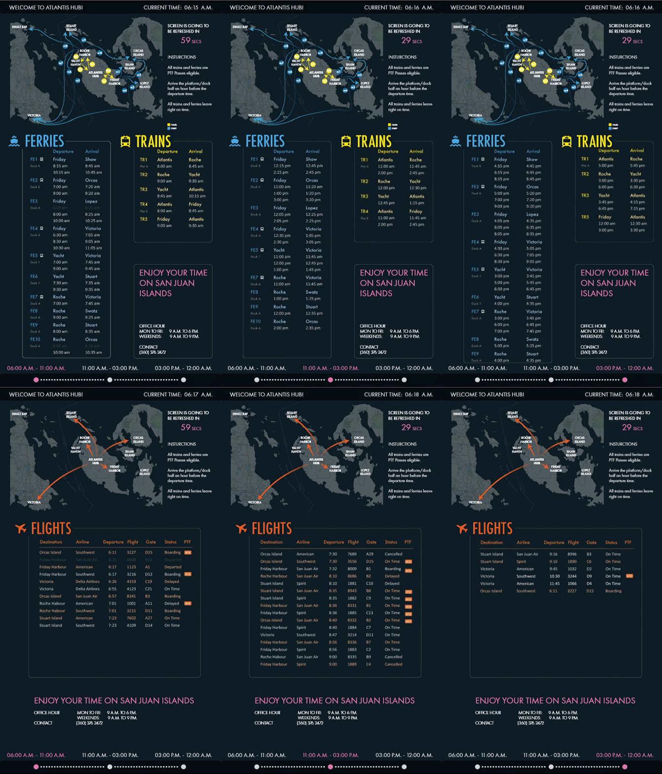
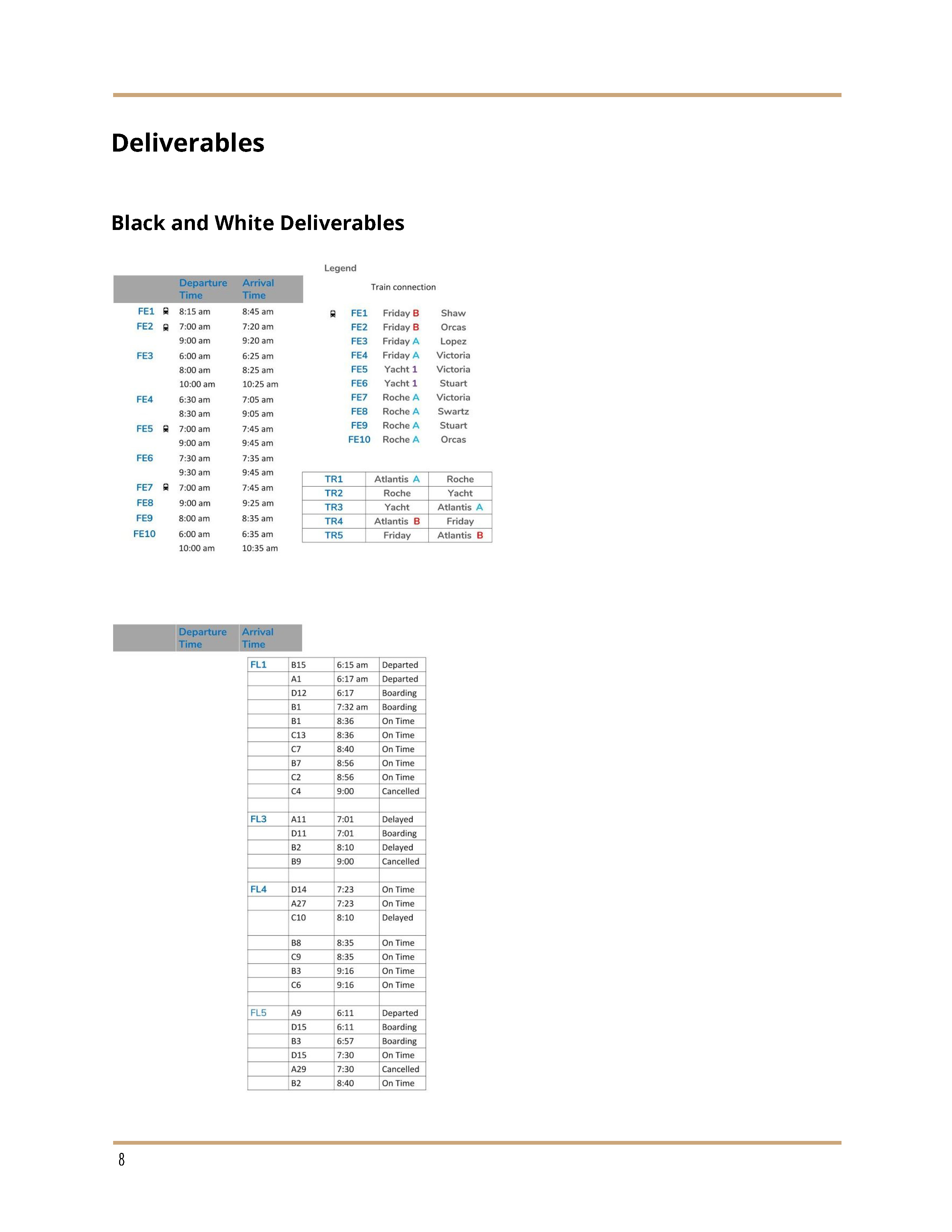
In this project, we, teamed up as three, are given an excel file of transporational data to sort out as needed and design a display for the information in three weeks.
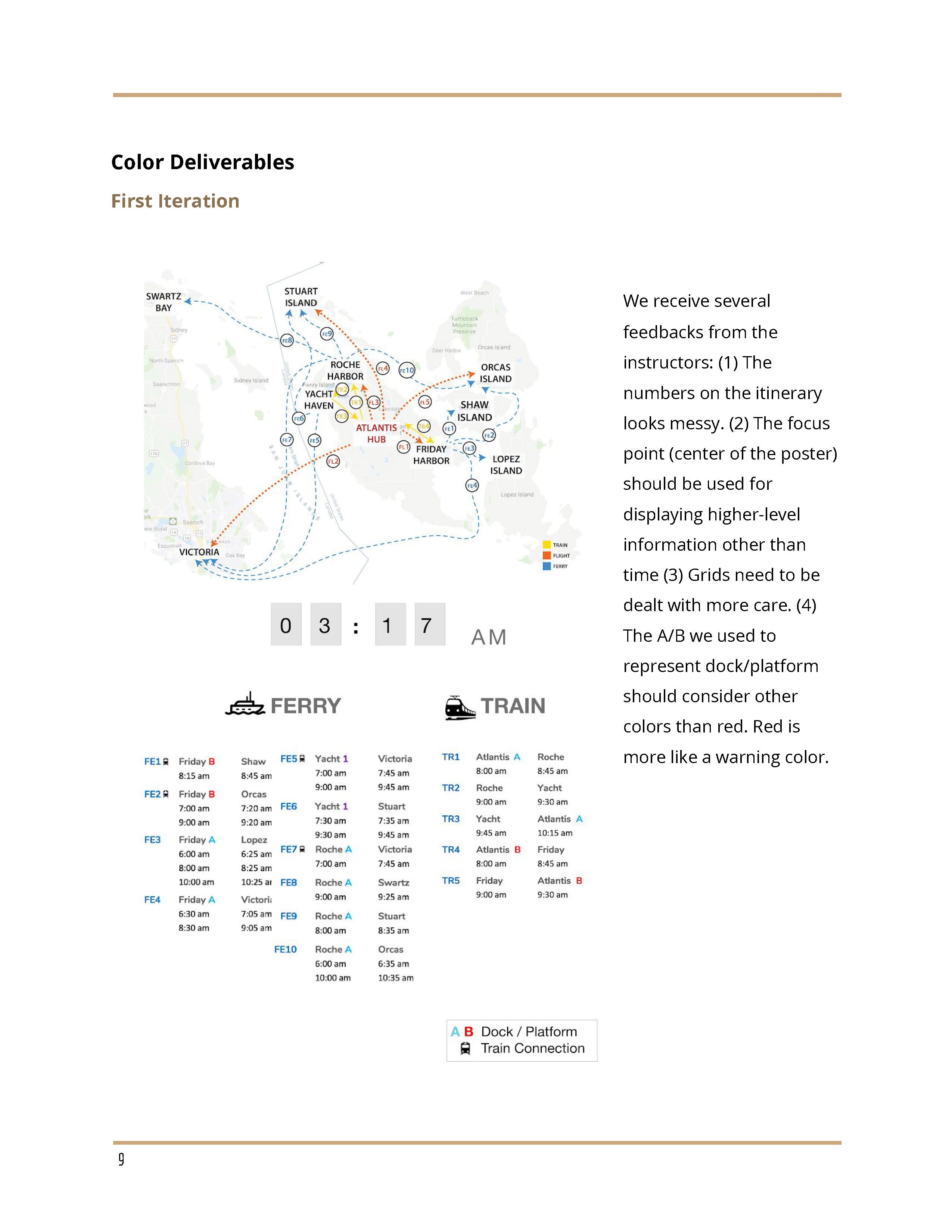
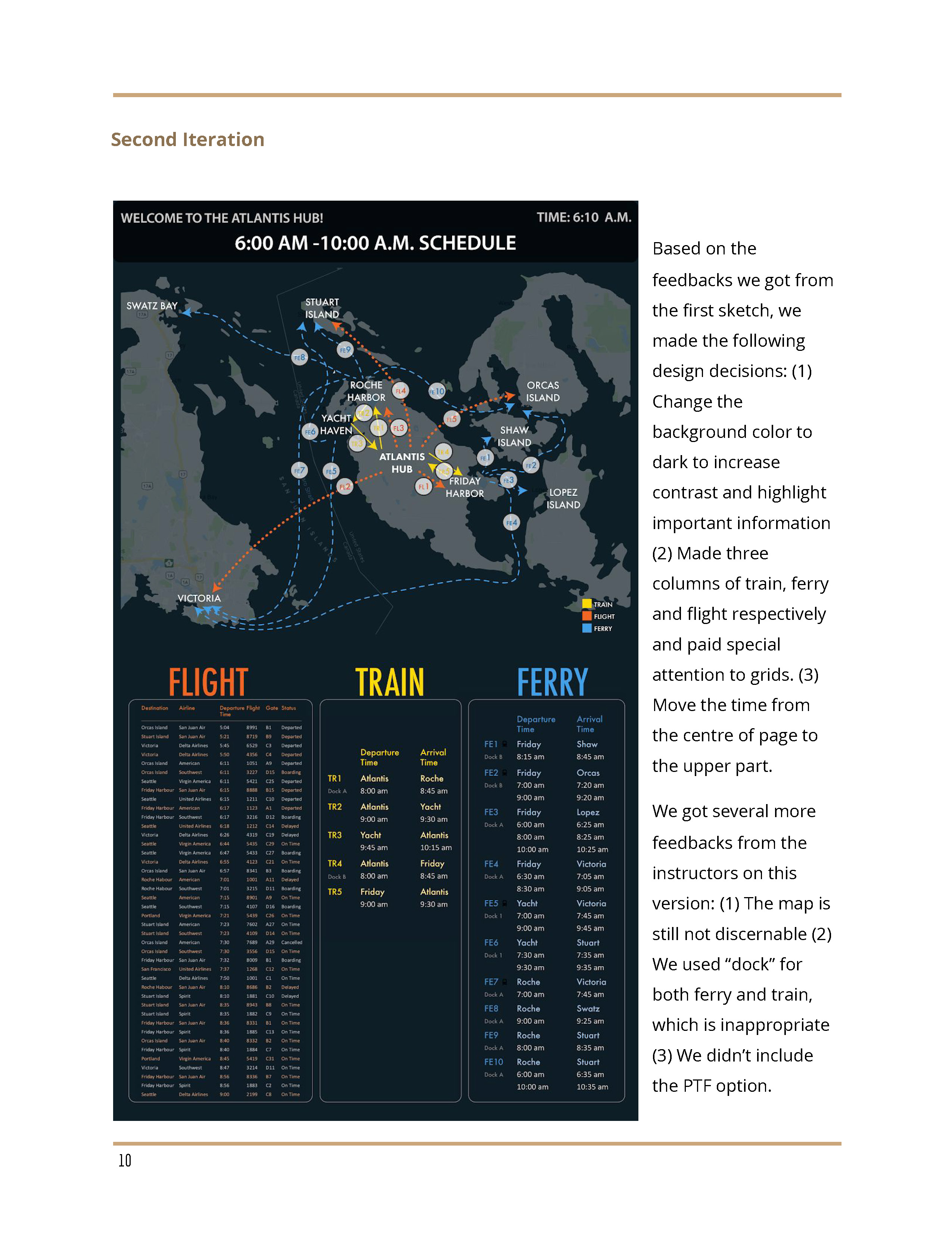
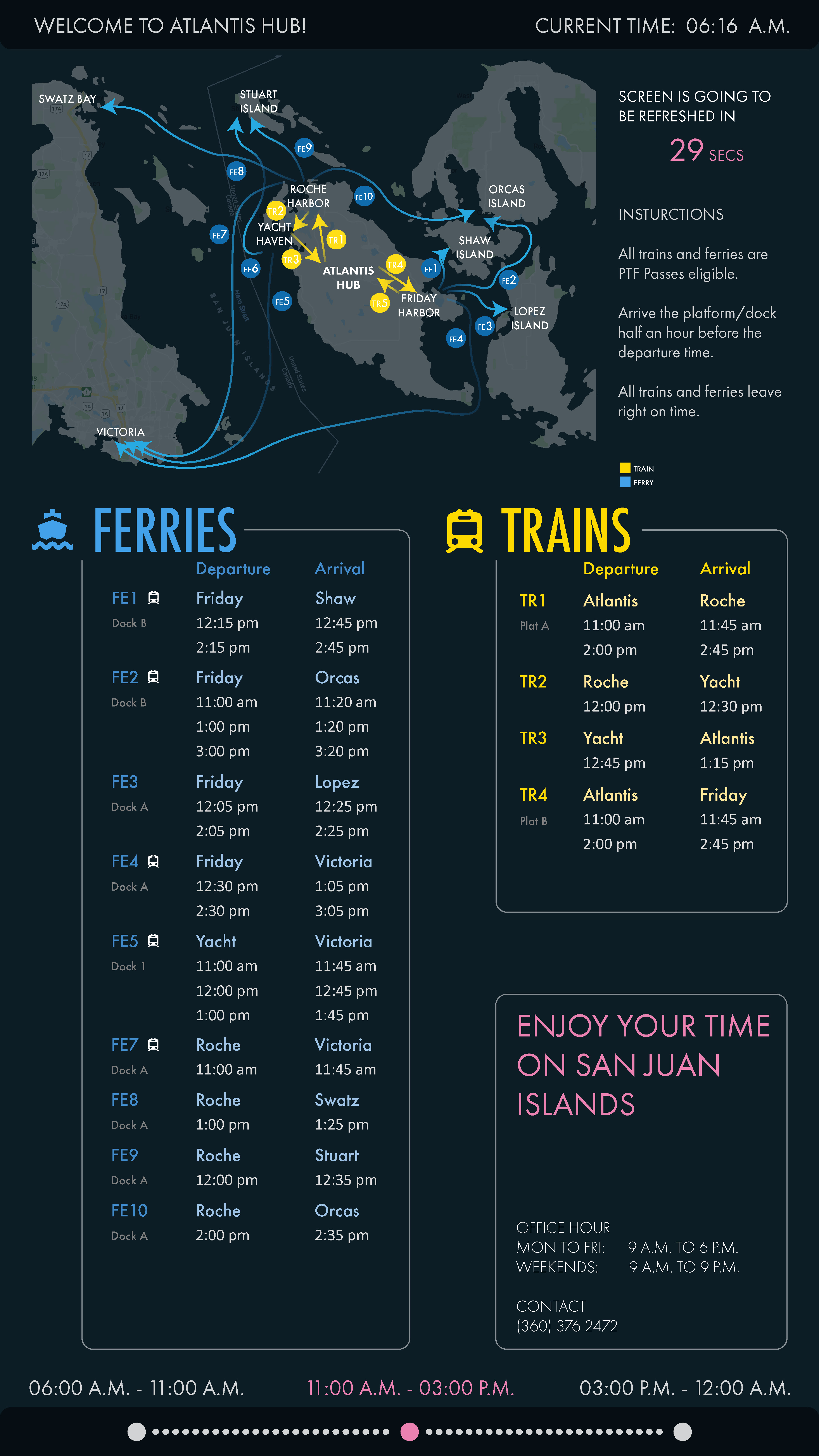
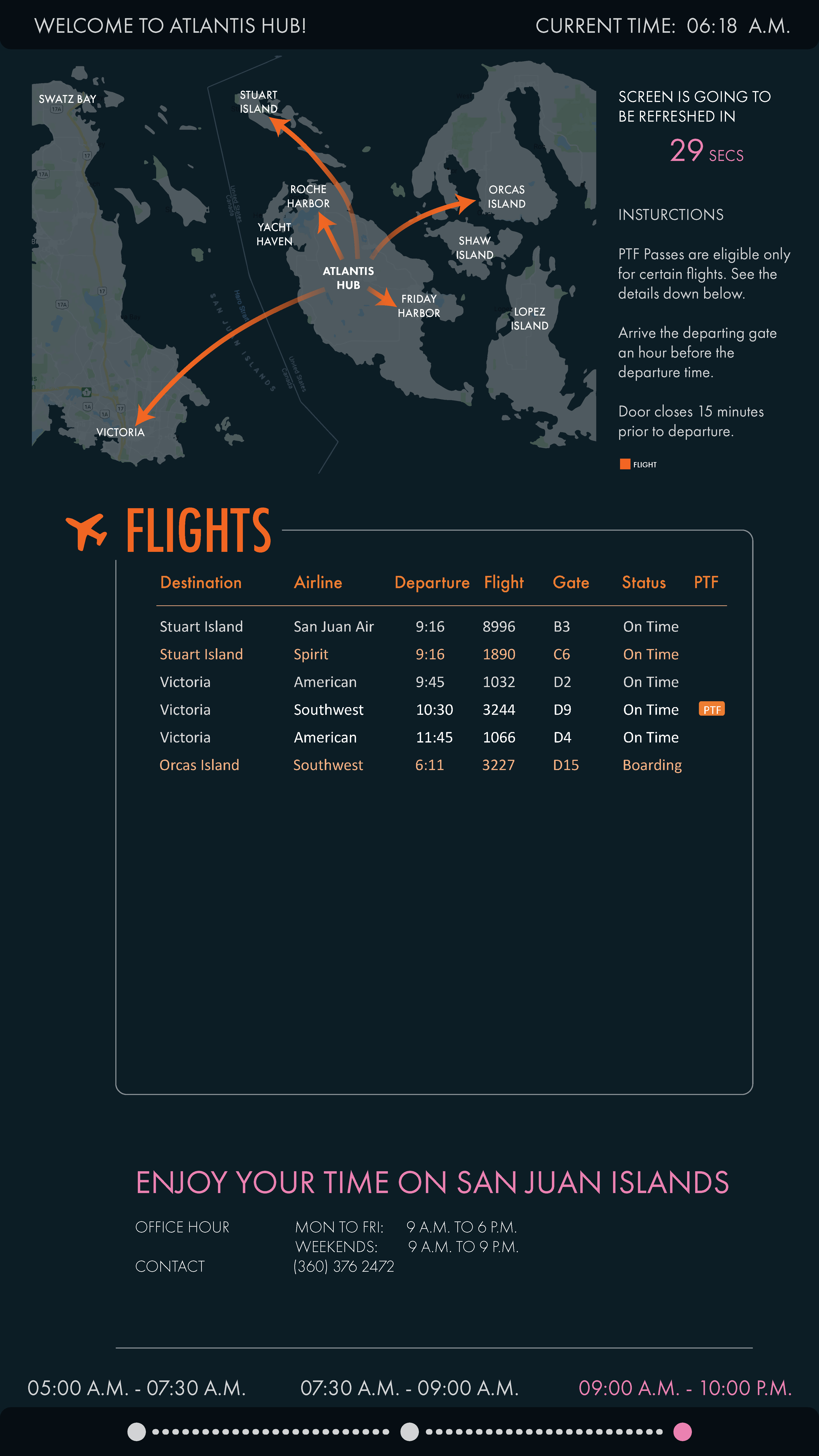
After several iterations, we came up with the idea of this display. We believe this display can serve users in a much more friendly way.
PROBLEM
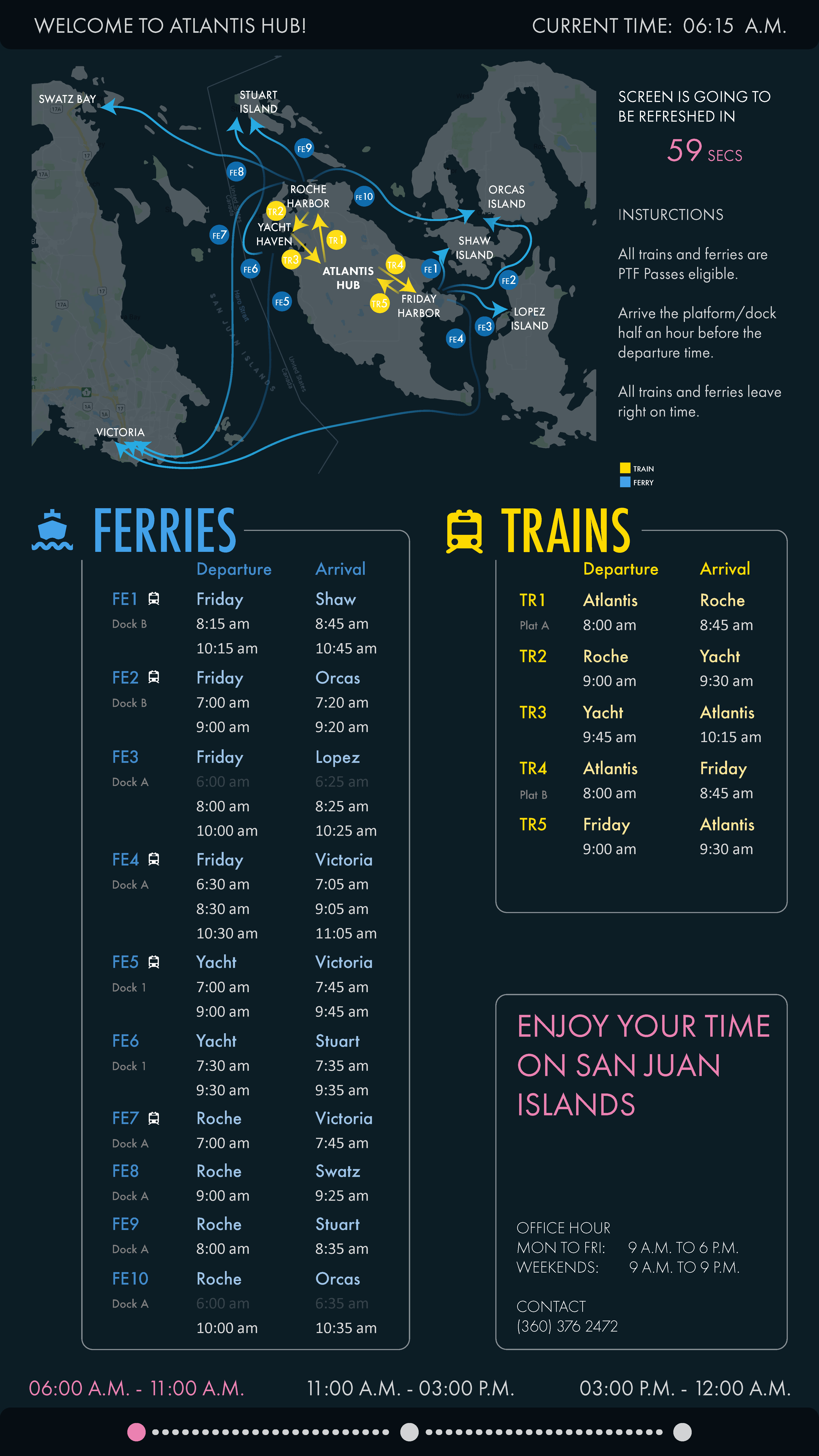
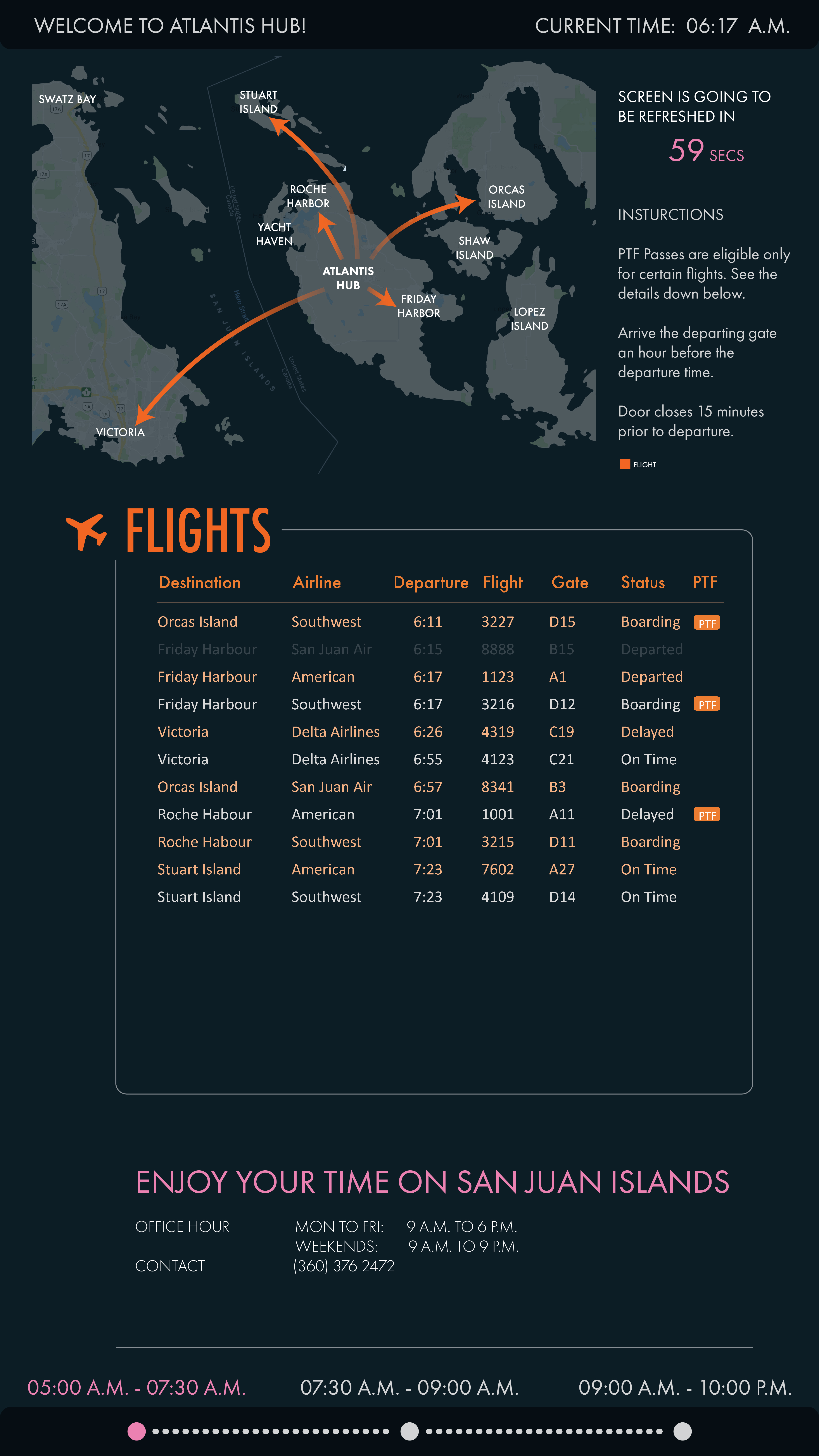
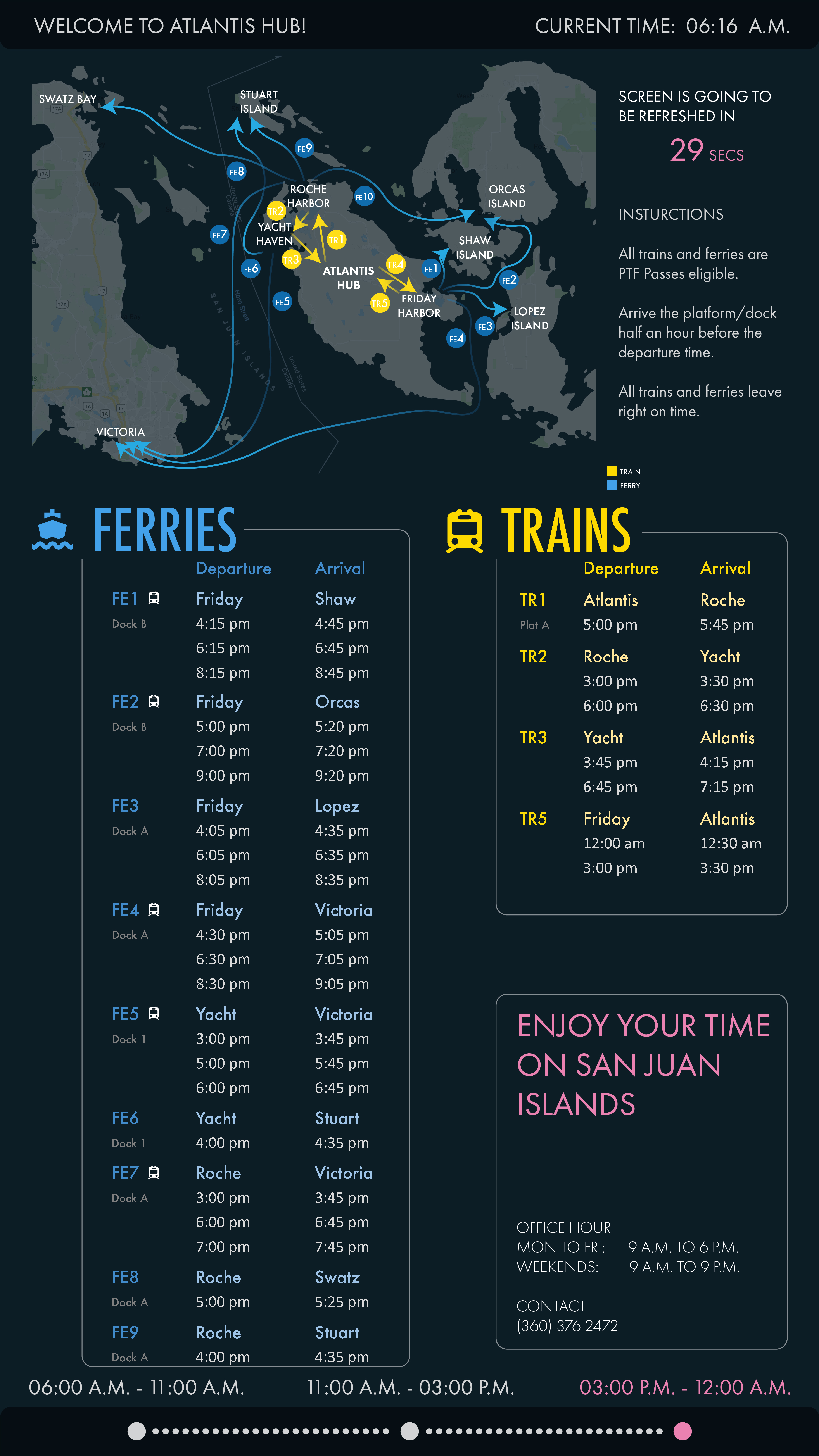
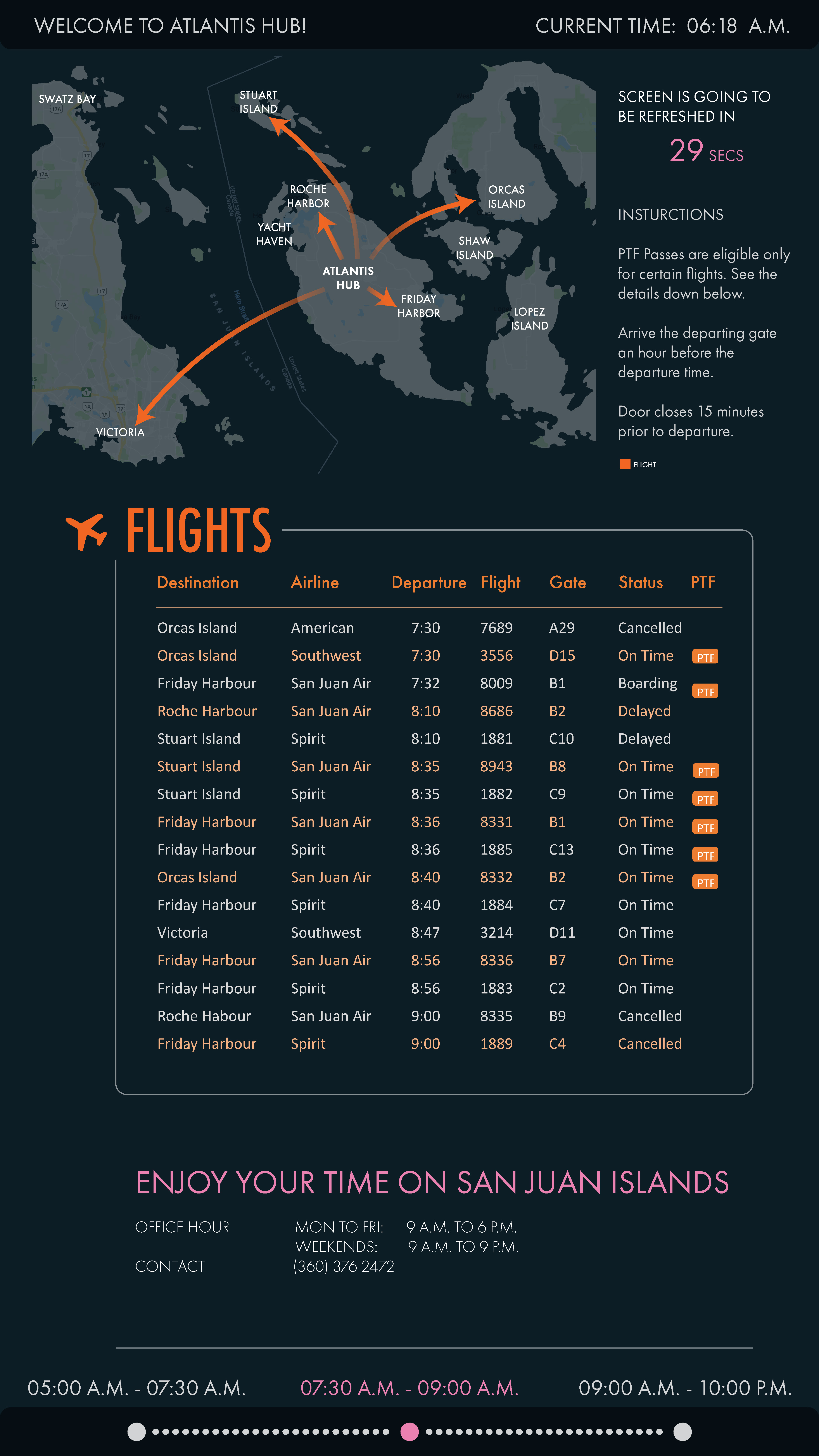
Atlantis Hub has tons of information in an Excel file about its transporational data. They are seeking for solutions to sort the data out and display the useful info in a clean and user-friendly way.
PROPOSAL
We choose a vertial display for natural reading of users so that they can easily compare the map information and the data below. Information are divided into different layers and hierarchies to avoid excessive information in one page. We split flight map from train/ferry map to make it look more clean. For color usage, we chose blue, yellow, pink, orange because they look obvious against a dark background. We avoid using meaningful colors like red, which may mislead users. For animation and display of information, we include at the bottom of page what time span we are showing. We also make it on the top that how long will the screen be refreshed, so that users could have a more clear idea as to how everything would be displayed in order while they are waiting.
